Meta began rolling out an update to WhatsApp for Android a few days ago, bringing a whole new user experience that is more comfortable to use, includes additional capabilities, and is cleaner and more contemporary.
However, the company made no announcements, most likely because the updated UI was unavailable to all users. Well, the brand has finished deploying the app’s new look to everyone, and Meta has published an announcement about it.
In a recent post on X (formerly known as Twitter) and Meta’s official website, Meta said it is “rolling out design updates to give WhatsApp a fresh new look while keeping it familiar + easy to use.” The new design introduces several adjustments.
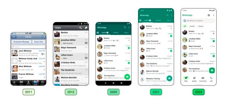
From now on, the tabs will be at the bottom of the screen rather than the top, and there are now four instead of three.
Also, it displays conversation filters just above the chat list, making discovering unread and group talks more straightforward.
Meta added that you now have a search bar rather than a button.
Lastly, the software now has a new colour palette and icons, significantly improving its appearance. You can see the difference between the old and latest designs in the image below.

Follow us on socials → Telegram | X/Twitter | Facebook | WhatsApp |WhatsApp Channel |Mobile App
Download the newest version from the Google Play Store to receive the latest design for WhatsApp on your Galaxy smartphone or tablet. The revised UI is now available in version 2.224.9.78 of the Galaxy S23 in India app. The redesigned UI is also available for iOS.
Have you got a news article or press release? Talk to us! Could you email our team at fmtblog4u@gmail.com? or WhatsApp Here? You can stay anonymous or get credit for the news; it’s your choice.
Source


